Basic Tutorial
- Using the View Results (Interface)
- Regional Report
- Regional Maps: zee and zed in Southern Ontario
- Question by Region: couch and chesterfield
(Skip ahead to Intermediate Tutorial)
1. Using the View Results (Interface)
- For this tutorial, the View Results window appears in the top half, so that you can follow the tutorial more easily. It normally appears in a window on its own. Resize this window to your liking now and click Reload (if necessary).
- How do I find the question I want to work with?
- Click on Questionnaire on the Navigation Bar. This brings up a new window with the survey questionnaire. Scroll through it until you find a question that interests you.
- How do I start working with the databases?
Use the View Results Interface. Whenever you are working without a Tutorial, click on View Results on the Navigation Bar. This brings up a new window View Results (Interface). Keep this window open, as you will use it to request new charts and graphs. As long as this window remains open, it will retain your latest settings.
- A new window opens when I submit a query. How do I keep track of all these new windows?
- When using the Interface, you can choose your own Window Name and enter it in the textbox provided. This will replace the default DT Results header with the text of your choice, making the windows easier to find. Also, you should close all windows that you no longer need.
Use the submenu under Communicator (if using Netscape) or Window (if using Internet Explorer) to switch quickly from window to window.
- What is the difference between Golden Horseshoe (All), Golden Horseshoe (Canada), Golden Horseshoe (New York), Golden Horseshoe 2000 (Canada), and Golden Horseshoe 2000 (New York)?
- Located at the western tip of Lake Ontario, the Golden Horseshoe is the most populous region in Canada. This 250 km strip is the home of more than one-sixth of Canada's population.
The Dialect Topography questionnaire was distributed in the Golden Horseshoe originally in 1991, and a second project in the same area was initiated in 2000. These two databases provide a basis for real-time comparisons.
The original GH database contains both Canadian respondents and U.S. respondents across the Niagara border. Since there are some significant dialect differences between these two regions, analyses will be more accurate if they are treated separately. Thus, the Golden Horseshoe (All) database should rarely be selected; use Golden Horseshoe (Canada) or Golden Horseshoe (New York) instead.
Note that Golden Horseshoe databases do not include the Language Use Index.
2. Regional Report
- How do I find out how people in the Ottawa Valley answered the questionnaire, overall?
-
- Under Report Type, click on the button Regional Report.
- Under Project Region, use the pulldown menu to select Ottawa Valley.
- Submit Query.
- A new window will open, listing every question with every response, followed by tables of statistics on the survey respondents. The Statistics link will take you directly to the stats once the page finishes loading. This is the best method for getting an overview of who said what in a single region, for every question.
- I don't want to see anything under 5 percent because they clutter the table. What can I do?
- You can set the Percentage Threshold. The default setting is Show all percentages, but you can:
- Select Do not show percentages below...
- Enter 5 (or any other number) in the space provided.
- Submit Query.
- You will see that the tables produced now have pink lines labelled Other responses, which is a sum of all responses with less than 5 percent. Only the top variants (over 5 percent) are shown.
- What if I want results for only a single question?
- You should use Regional Maps, Question by Region, or By Subregion instead. See below.
3. Regional Maps
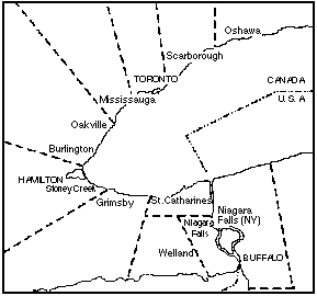
In this section, we will look at zee and zed in Southern Ontario. It will be useful if you read zee and zed in Southern Ontario beforehand.- Which databases support maps?
- Currently, Ottawa Valley and the Golden Horshoe databases support maps. Other maps may be added for the other databases in the future.
- Suppose I want a map of zee and zed in the Golden Horseshoe that shows what percent of people say zed. How do I make one?
- There are two databases of the Golden Horseshoe (1991 and 2000). We will choose Golden Horseshoe 1991 for this example.
- Under Report Type, select Regional Maps.
- Under Project Region, select Golden Horseshoe (All). For this function, you can also choose Golden Horseshoe (Canada) or (New York); it makes no difference.
- Under Question, select q62 - z.
- Submit Query.
- A new window, Regional Maps (Interface), will appear. Now, you have several new options.
- Choose the response you wish to map from the pulldown menu. We will select 2. [zed].
- Leave the default setting for Map Type as Bulk percentages.
- Leave the default settings for Names and Numbers On.
- Type zed in the Descriptor textbox.
- Submit Query.
- After a few moments, a new window will appear. The table at the top summarizes the breakdown by place for the variant 2. [zed] that appears on the two maps below. One map shows the percentages with different colours, while the other shows the same information with gradients of red. Note that percentages are always rounded off.
- What format are these maps?
- These maps are JPEG files. Depending on your browser and system, you can either save them or copy them onto your desktop. You can usually click and hold on the picture (or graph) you want, and access functions like opening the picture in a new window or saving it as a .jpg file. Rename them with a .jpg extension.
- Suppose I don't want the maps to show place names.
- You can turn off place names and number displays using the Names and Numbers options.
- I can't seem to enter long descriptors (2+ words) like different from.
- The program does not accept descriptors separated by spaces, or enclosed in quotation marks. Instead, a possible solution is to use an underscore (e.g., different_from.)
- I would like to see maps with age breakdowns.
-
- Return to Regional Map (Interface) - Golden Horseshoe.
- Under Map Type, select Percentages by age.
- Submit Query.
- A window will open with breakdowns by age, with maps for every age group. A line representing age appears beneath these graphs, tracking the appropriate age. These images may be saved and imported into, say, a PowerPoint presentation, to demonstrate apparent-time and/or spatial diffusion dynamically.
- Suppose I need to enter recalculated percentages for mapping, e.g., for combining two responses. How do I map these?
- You can activate Manual entry.
- Return to Regional Map (Interface) - Golden Horseshoe.
- Under Map Type, select Manual entry.
- Submit Query.
- A window similar to the Regional Map (Interface) will open, with a few differences.
- Age can be set, if desired.
- Textboxes for each subregion are provided for manual entry of percentages.
- Practice:
- Request a region map of Ottawa Valley for question 66, where [w] and [wh] sound the same. Give it the descriptor W and do not show place names.
4. Question by Region
In this section, we will look at couch and chesterfield. It will be useful if you read couch is replacing chesterfield beforehand.- How do I view the Golden Horseshoe responses for Question 2, without using the Regional Report?
-
- Use the View Results (Interface).
- Under Report Type, select Question by Region.
- Under Project Region, use the pulldown menu to select Golden Horseshoe (All).
- Under Question, select q2 - three seater.
- Check the Independent Variable menu and set it to [blank], because we don't want to look at Age just yet.
- Submit Query.
After a few moments, a window with a table will appear. This lists all the variants given for Q2 in the Golden Horseshoe, and the percentage of all respondents that gave that specific response. The green Subtotal line counts the number of people who answered the question. (For now, ignore the advanced Regional Comparisons functions in the purple shaded area).
You will notice that there are close to 30 different responses for Q2 in the Golden Horseshoe, including variant spellings such as coach and double responses such as love seat, sofa. The program treats these as separate entries.
- I would like to see a breakdown by age.
-
- Using the Independent Variable pulldown menu, select Age.
- Submit Query.
You will see new columns and breakdowns by age. Other independent variables may be selected, but we will work with Age for now.
- The time it takes to generate the table seems to be increasing.
- Certain questions and options take longer to process. Open questions (where people write in their responses) will take longer than closed questions (where people select from a list of options). In general, the more rows or columns there are, the longer it takes to generate. Please be patient.
- I don't want the people who didn't answer this question to be included in the percent calculation.
- The Null Responses option allows you to generate a separate table that recalculates percentages while omitting the null responses. This was automatically done for you with Regional Maps, but needs to be set manually for Question by Region.
- Set the Null Responses option to Omit null responses.
- This function requires Percentage Threshold to be set to Show all percentages.
- Submit Query.
- Suppose I want to graph the top two responses for question 2 in Golden Horseshoe (Canada). What do I do?
- Under Project Region, select Golden Horseshoe (Canada).
- Make sure Show all percentages and Omit null responses are selected.
- Under Graph, select Top Two Responses.
- Change bar colours (if desired) by using the pulldown menus. The default First colour is Orange, and the default Second colour is Aqua.
The resulting bar graphs should resemble the line graph in the couch excerpt, with expected minor differences. Remember that the graphs generated do not take into account spelling variants and other factors that affect percentage calculation; recalculation may be required for some questions. We will look at line graphs in the Intermediate Tutorial.
- Practice:
- Create tables from the Montreal database that look at question 29 (tomato), and exclude null responses from the percent calculation. Include a breakdown by sex, and graph the top response in blue.